
Citibanamex App
Making mobile banking feel safe, simple, and familiar
This was the first project I led at Citibanamex. In 2017, mobile banking in Mexico was still new, and user trust was low—especially when it came to making transfers. The existing app flow wasn’t converting users into regular mobile bankers. I quickly saw that to build trust, the app needed to feel familiar, intuitive, and transparent.
Client
Citibanamex
Year
2018
Research & Discovery
Discovery Session
We hosted in-person discovery sessions at our offices to understand how users approached banking, what role their phones played in daily life, and what apps they actually loved using.

Interview Findings
-
Users distrusted formal banking language—it felt cold and even sketchy.
-
They disliked confusion and valued clarity and predictability.
-
If something went wrong, users felt they had no one to turn to—so they avoided the risk.
-
Apps they loved: Apple Pay, Spotify, Netflix and Bancomer
-
Many didn’t realize what services Citibanamex offered, or didn’t use the app at all.
Benchmark
I audited best-in-class apps globally to understand how they were building user confidence.
Benchmark Findings
-
Friendly, human voice and tone
-
Large readable digits
for accessibility
-
Clear, visual flows showing who, how much, from where, and what’s left
-
Visible confirmation (checkmarks, receipts) for completed transfers
-
Easy-to-access contact list for frequent transfers
User + User Goals

Carlos, 25
Social media manager
Carlos is spending the summer in Barcelona. He needs to pay rent and utilities from his phone, split dinner bills with friends when no one has cash, and withdraw money without carrying his physical cards.
He wants
- International access
- Cardless withdrawals
- Easy service payments
- Expense filtering
- Financial freedom
What’s holding him back
- Limited finances
- Distrust in banking apps
- Battery anxiety
- Unexpected fees

Lorena, 34
Senior Accounting Adult
Lorena visits the bank on her lunch breaks, but wishes she didn’t have to. She downloaded the app, but gave up after struggling with passwords and not knowing how to use it. She’s active on social media and wonders why banking apps can’t feel as intuitive or personal.
She wants
- Simplicity
- To feel connected
- Smooth, intuitive use
- Personalization
What’s holding her back
- Overwhelming info
- Poor navigation
- Complicated logins
- Lack of clear guidance
User Goals
Primary Goal
As a user, I need to clearly understand how much I’m sending and what I’ll have left, in order to feel confident completing a transfer.
Secondary Goal
As a user, I need a simple and intuitive flow to send money, in order to avoid mistakes and save time.
Analysis
Feature Prioritization
We used a value vs. feasibility matrix to prioritize features, focusing on what users needed most while aligning with stakeholder input and technical constraints.

Design Principles
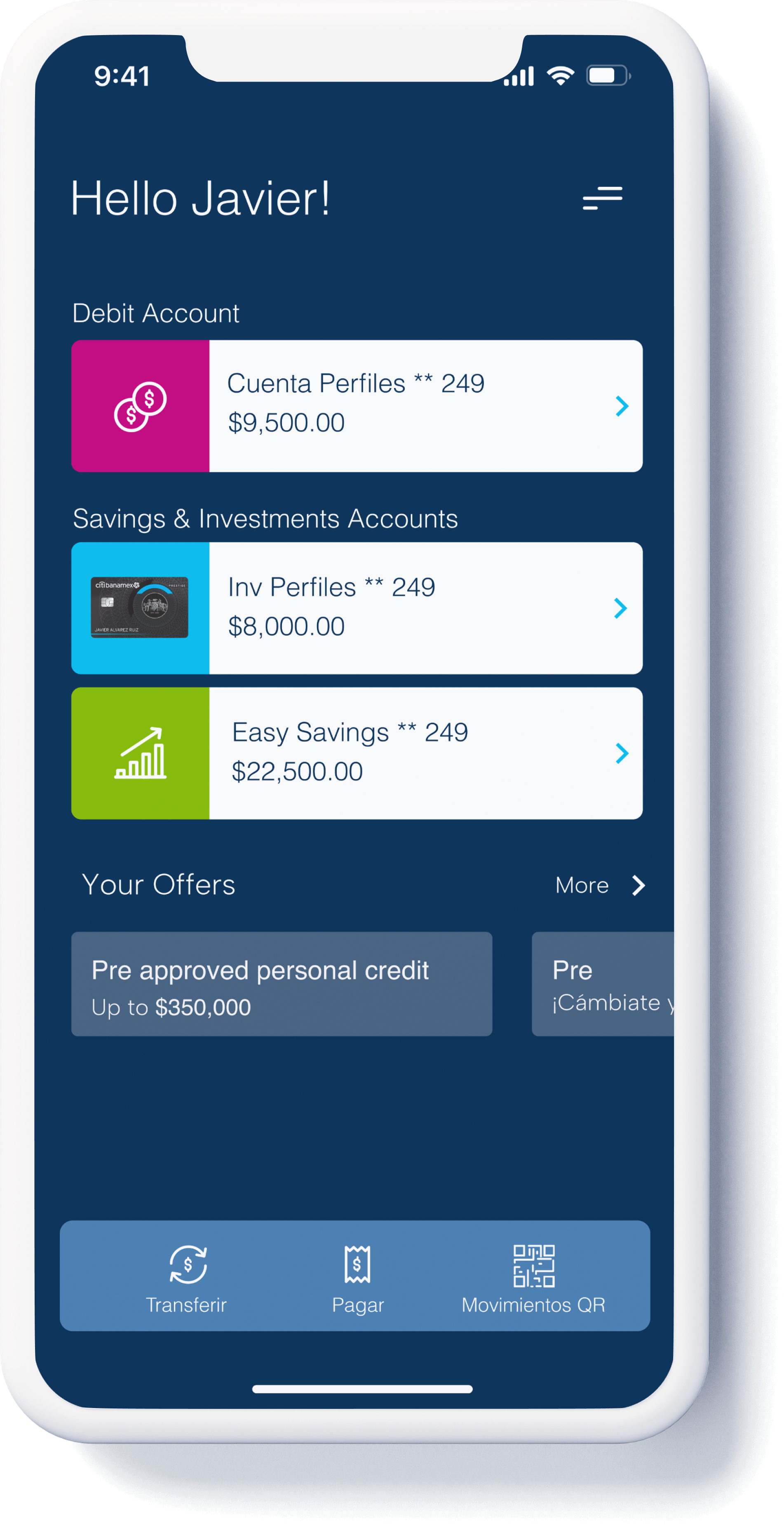
-
Accesible
Designed for clarity and readability, with large digits, intuitive flows, and clear language to ensure everyone—regardless of tech confidence—can complete key tasks with ease.
-
Honest
We prioritized transparency: showing fees, transfer summaries, and remaining balances upfront so users feel in control and informed before taking action.
-
Familiar
The interface borrowed familiar patterns from apps users already trust to reduce friction and help them feel at home.
-
Human
We used a friendly tone and simplified content to remove the cold, formal feel often associated with banks—building trust through empathy and clarity.
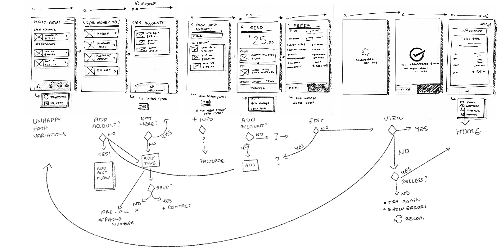
Low Fidelity & Flows